

- What are Pastel Colors?
- The Science Behind Pastel Colors
- Types of Pastel Colors: Hex Codes for Every Shade
- The Psychology of Pastel Colors
- Best Pastel Color Palettes and Combinations
- How to Use Pastel Colors in Design
- Pastel Colors in Branding
- Pastel Color Trends in 2026
- Common Mistakes When Using Pastel Colors
- Frequently Asked Questions
- Conclusion



What Are Pastel Colors? Complete Guide With Hex Codes, RGB Values & Palettes
- Pastel colors are tints: any pure hue mixed with white until saturation drops below 40% and lightness rises above 75% in HSL.
- Both conditions must be true. Change either value and the color leaves the pastel range.
- This guide lists 25 named pastel shades with hex, RGB, HSL and CMYK values, ready to copy into Figma, Canva or CSS.
- Pantone named Cloud Dancer its 2026 Color of the Year - a soft off-white that anchors almost every pastel palette shipping this year.
Color shapes first impressions before users read a headline, click a button, or explore a product. Among today's most popular design trends, pastel colors have become a go-to choice for brands that want to feel modern, approachable, and visually effortless.
From SaaS dashboards and mobile apps to beauty packaging and lifestyle brands, pastel palettes are everywhere. Their soft appearance helps reduce visual noise while creating experiences that feel calm, welcoming, and memorable.
But choosing a few light colors doesn't automatically create a pastel palette, and many designers mistake muted colors for true pastels.
In this guide, you'll learn what pastel colors are, how they're created, the psychology behind them, popular pastel shades with hex codes, and practical ways to use pastel color palettes in branding, UI design, and everyday creative work.
What Are Pastel Colors?
A pastel color is a tint: any pure hue mixed with white until it loses its original intensity and becomes soft, light and low in saturation. As Wikipedia puts it, pastels belong to a pale family of colors which, described in the HSV color space, have high value and low to medium saturation.
Every pastel shares two defining traits: high lightness and low saturation. Baby pink starts as red. Powder blue starts as blue. Mint green starts as green. Each becomes a pastel once enough white enters the formula.
What separates pastels from other soft colors is that exact technical balance - luminous without being vivid, airy without disappearing into white.
Pastel vs. Muted vs. Vivid: The Exact Difference
Pastels and muted colors are not the same thing, and the confusion produces palettes that read flat and gray instead of fresh and soft. Pastels carry high lightness, which gives them an airy, near-white quality.
Muted colors sit at medium lightness and medium saturation - they read dusty or earthy. Vivid colors sit at the opposite extreme: full saturation, maximum intensity.
One more distinction worth holding onto: adding white produces a pastel. Adding gray or black produces a pale or muted color, which is a different category entirely.
The Science Behind Pastel Colors
Every color has three values: hue, saturation and lightness. Pastels live at one specific coordinate - low saturation combined with high lightness. A true pastel requires saturation below roughly 40% and lightness above 75% in HSL. Shift either number outside that zone and the color stops reading as a pastel.
Hue: The Starting Point
Hue is the identity of the color: red, yellow, blue, green, purple, orange. Every pastel inherits its personality from its underlying hue. Pastel pink stays pink. Pastel blue stays blue. Without a distinct hue, a pastel collapses into a near-white gray with no character.
Saturation: The Key to Softness
Saturation controls how much of the pure hue survives in the final color. High saturation produces bold, vivid tones. Drop saturation below 40% and the color fades into a gentler version of itself. That drop is what makes pastels feel calm rather than aggressive.
Lightness: What Creates the Airy Feel
Lightness measures how close a color sits to white. Push lightness above 75% and the color takes on a soft, sun-bleached quality. High lightness plus low saturation is the double condition behind every true pastel. Neither one carries the effect alone.
Understanding where each hue sits before applying pastel tinting makes palette decisions far more predictable. Our guide to the color wheel covers the hue relationships that determine which pastel combinations naturally harmonize.
Complete List of Pastel Color Names
If you just need names, here is the full list grouped by family.
- Pink: Baby pink (#FFD1DC), Blush (#FEC5BB), Rosewater (#FFD6D1)
- Blue: Powder blue (#AEC6CF), Baby blue (#A7C7E7), Periwinkle (#CCCCFF)
- Green: Mint green (#B2EBB2), Seafoam (#9FE2BF), Sage green (#B2C5B2), Pistachio (#C8F7C5)
- Purple: Lavender (#E6E6FA), Lilac (#C3B1E1), Mauve (#E0B0FF)
- Yellow: Pastel yellow (#FDFD96), Lemon chiffon (#FFFACD), Butter yellow (#F3E5AB)
- Orange: Peach (#FFDAB9), Apricot (#FBCEB1), Pastel orange (#FFD4B8)
- Coral: Pastel coral (#FFB7B2)
- Teal: Pastel turquoise (#AFEEEE), Aqua mist (#C4F0F0)
- Neutral: Greige (#E8E8E8), Warm beige (#F5E6D3), Dusty rose (#D4A5A5)
Pastel Colors by Family
Each pastel family carries a distinct emotional signal and a distinct set of design uses. Knowing the difference between pastel pink and pastel coral changes how a palette reads at a glance.
Pastel Pink - #FFD1DC
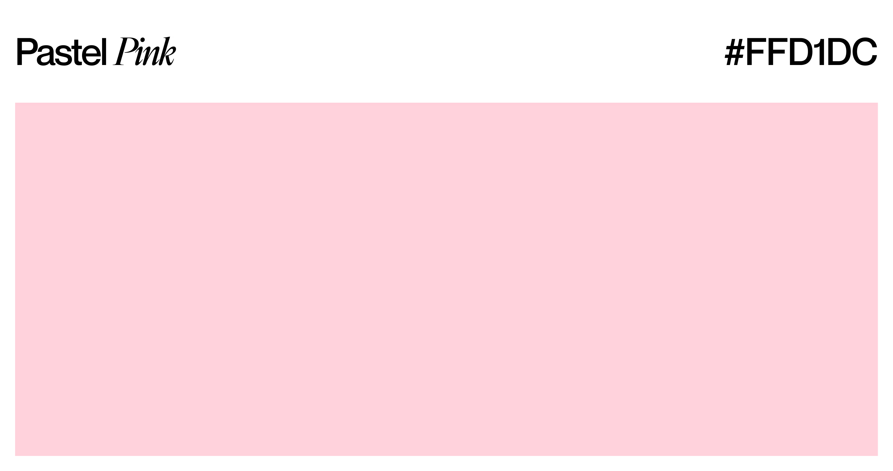
Pastel pink sits at the warm end of the soft spectrum. Its variants run from baby pink through blush to rosewater.
Brands use it to signal gentleness, romance and approachability - beauty, wellness and lifestyle categories reach for it most. Pair it with white or soft cream to stop it reading overly sweet.
Pastel Blue - #AEC6CF
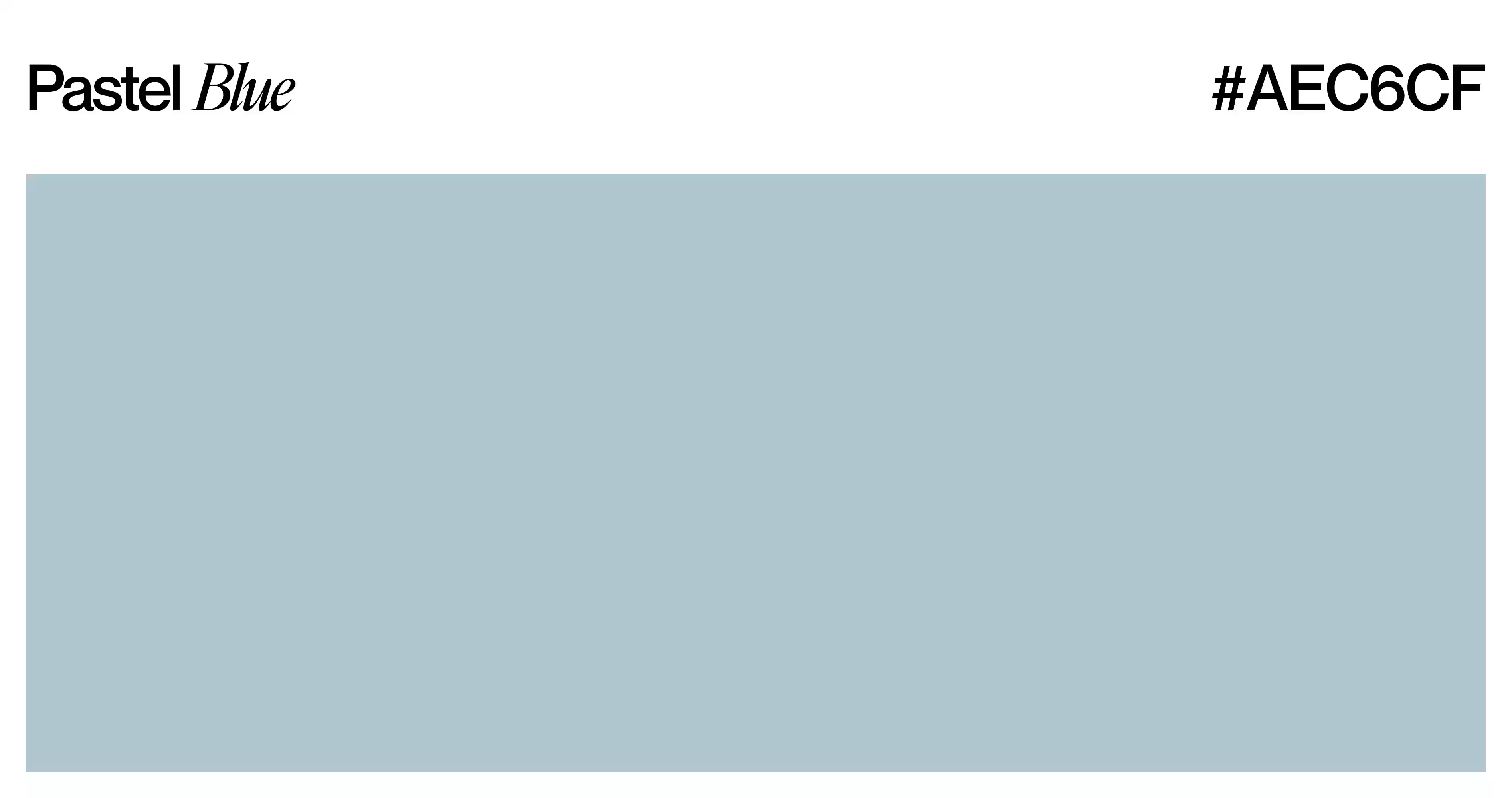
Pastel blue reads calm and professional. Powder blue, baby blue and periwinkle are its best-known variants. Healthcare, fintech and wellness products use it to feel trustworthy without the severity of a darker navy. It is the most broadly accepted pastel across demographics.
Pastel Green - #B2EBB2
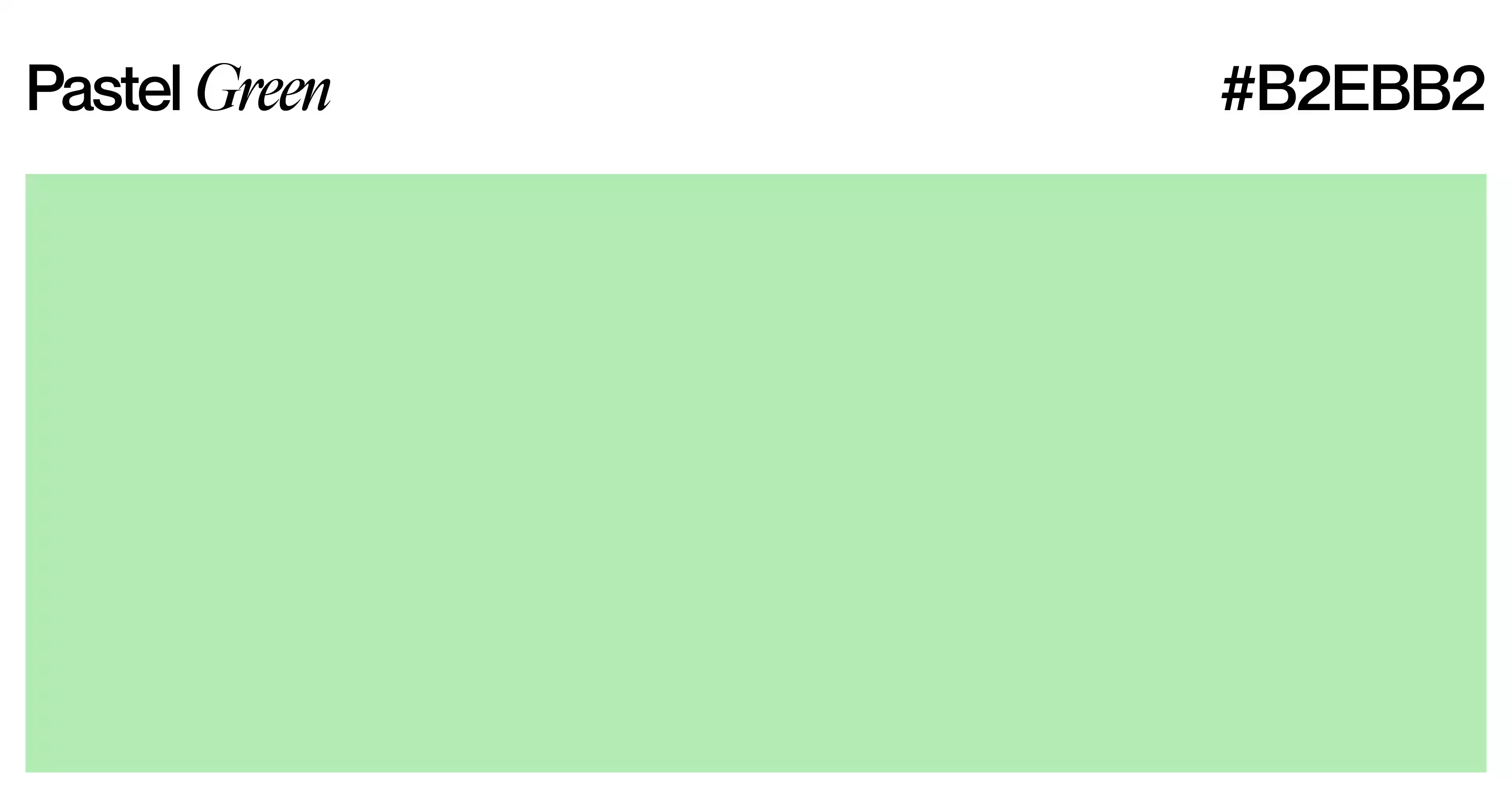
Mint, seafoam, sage and pistachio all live inside the pastel green family. Green pastels signal freshness, health and nature, which is why skincare and food brands lean on them. Sage in particular has become one of the dominant interior and branding tones of 2025 and 2026.
Pastel Purple - #E6E6FA
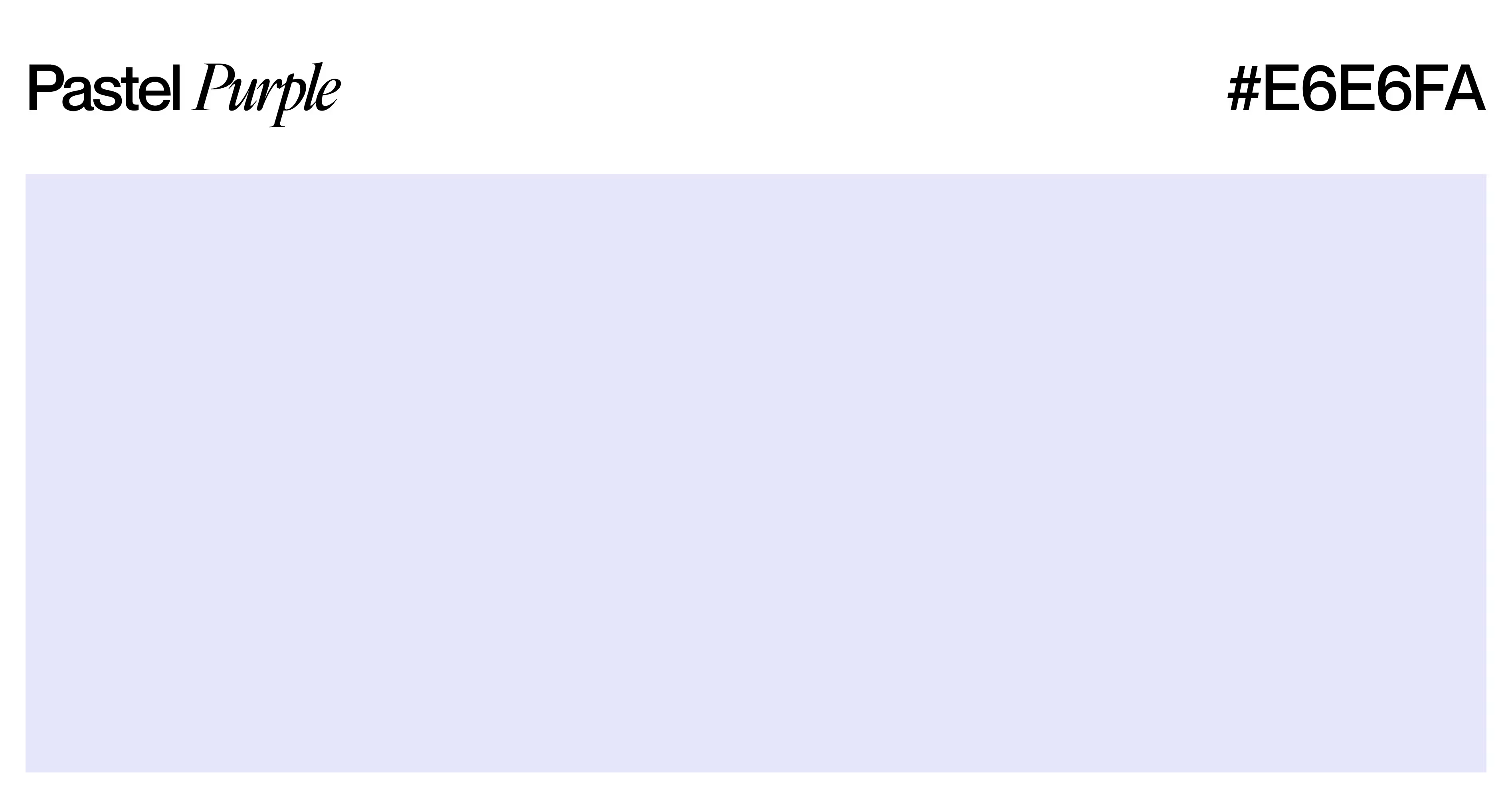
Lavender carries connotations of calm, creativity and understated luxury. Lilac reads warmer and more playful; mauve sits closer to true purple. Wellness brands and cosmetics use this family to signal premium quality without the formality of navy or black.
Pastel Yellow - #FDFD96
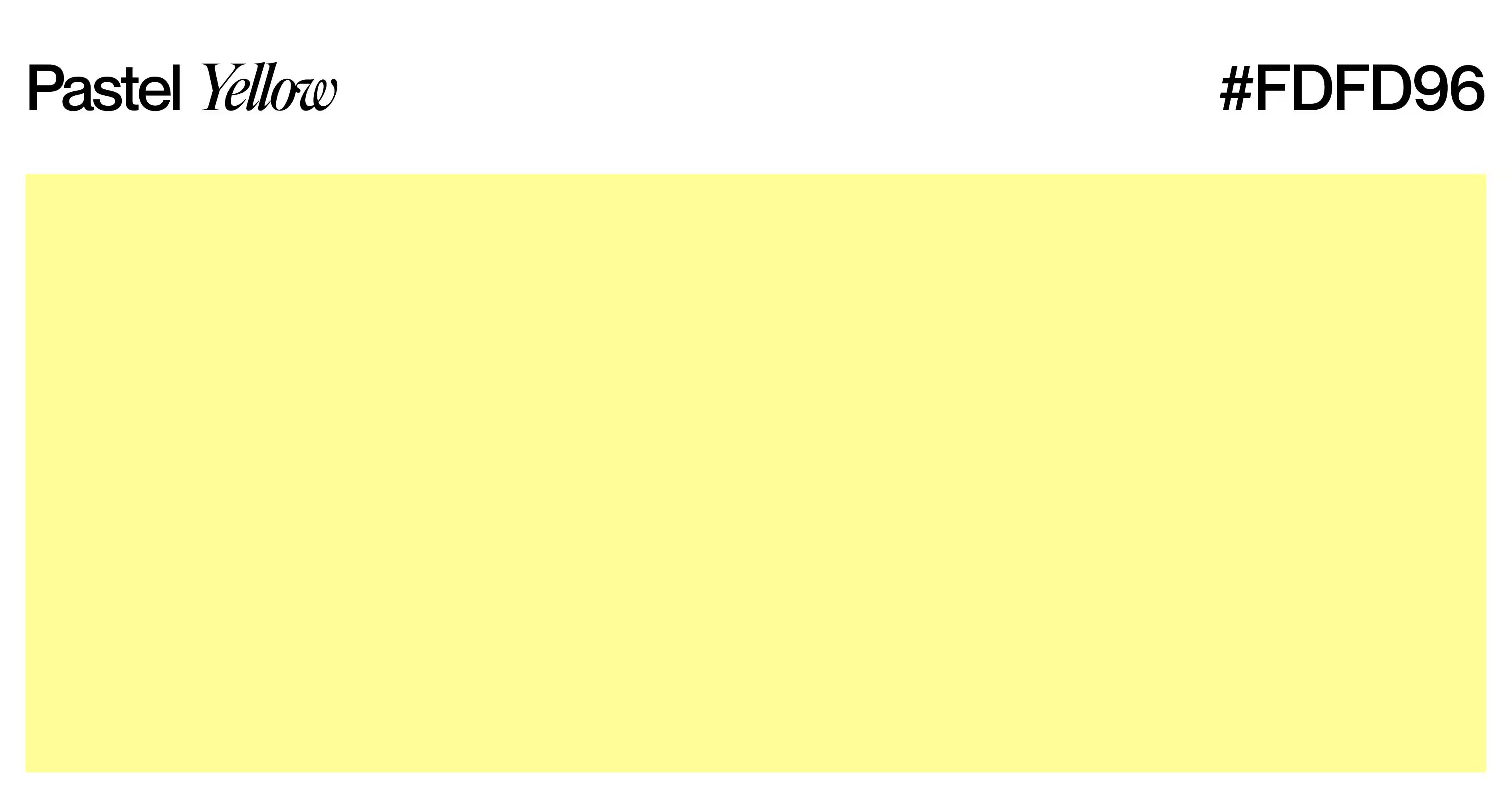
Butter yellow and lemon chiffon are the main variants. Pastel yellow feels optimistic and warm without the visual aggression of a saturated yellow. Lifestyle brands and children’s packaging use it to add brightness while keeping the palette gentle.
Pastel Orange, Peach and Coral - #FFDAB9

These sit at the warmest end of the pastel spectrum. Peach reads soft and approachable; coral edges toward energy without tipping into aggression; apricot splits the difference. All three work well in hospitality, food branding and summer campaign design.
Pastel Neutrals - #E8E8E8
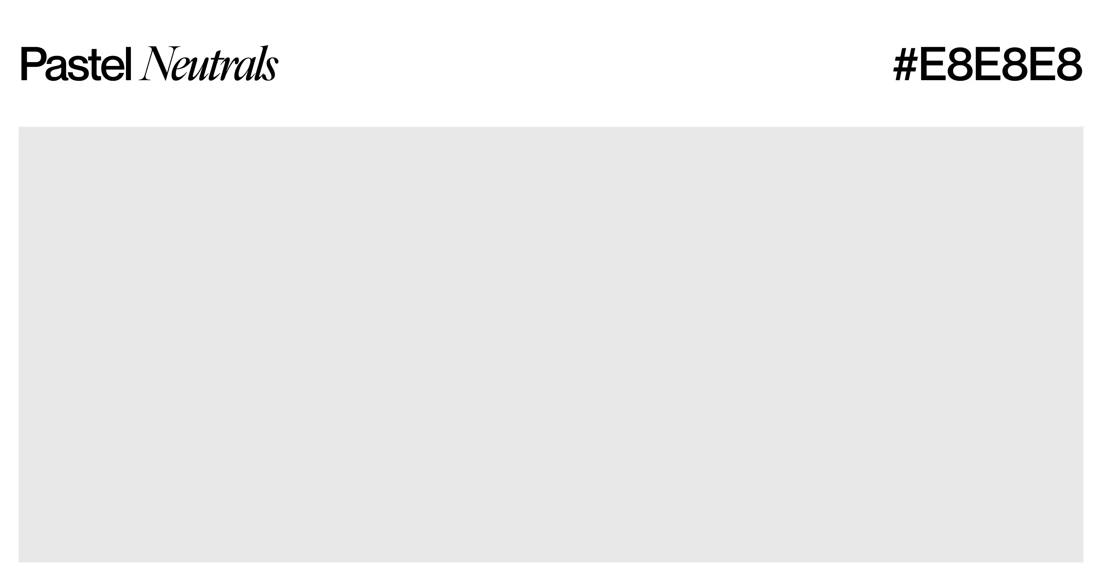
Greige, warm beige and dusty rose are the anchors. Used as backgrounds or card surfaces, they stop colorful pastels from looking oversaturated by comparison. Interior design and premium packaging use greige specifically as a grounding tone.
For context on which of these shades perform best across industries, most popular colors in design break down how specific tones land in different markets.
How to Use Pastel Colors in Design
Pastel colors work best in roles that benefit from their lightness: backgrounds, card surfaces, hover states, illustration accents, and decorative elements. Putting pastels into high-contrast roles like primary action buttons, error states, or warning icons reduces accessibility and dilutes the functional signal those elements need to carry. Knowing where a pastel fits and where it fails is the difference between a palette that looks intentional and one that just looks faded. Here's where pastels earn their place and where they don't.
Web Design and Landing Pages
Pastels work as background colors on landing pages because they reduce visual fatigue and create a sense of space. Use powder blue or sage green for the surface, then set body text in dark navy or charcoal for contrast. How background color choice affects conversion is covered in detail in this landing page design guide.
UI and Product Design
In product UI, pastels belong on surfaces, not primary action elements. Use pastel blue for card backgrounds. Use pastel green for success state backgrounds paired with a darker green icon. Keep interactive elements like buttons, links, and active states in darker, more saturated versions of the same hue so they register as clickable without guessing.
Branding and Marketing
Pastel palettes define entire brand identities in beauty, lifestyle, and wellness categories. Glossier built its brand visual system almost entirely from pastel pink and white. Outdoor Voices uses soft pastels to signal activity-without-intensity. Both brands demonstrate that pastels carry a clear, distinct personality without needing loud visual cues to communicate it.
Social Media and Content Design
Pastel color backgrounds on social posts improve scroll-stopping power in visually saturated feeds. A mint green or lavender background makes a still image look curated and intentional. Content creators use consistent pastel palettes for Instagram grids and Pinterest boards because the softness reads cohesively across thumbnails and repeated exposures.
Knowing how to use pastels across design formats is one skill. Deciding whether they belong in a specific brand identity is a separate judgment, and it depends on who you're designing for.
Pastel Colors in Branding
Pastel colors carry strong audience signals. A brand that adopts a pastel palette actively communicates softness, approachability, and a specific emotional register. That positioning works for some audiences and completely misses for others. Before choosing a pastel palette for any brand identity, ask two questions: does this color family match the people this brand actually serves? And does it fit what the product delivers? A fintech platform for institutional investors and a baby care brand are not the same pastel problem.
When Pastels Work for a Brand
Pastel palettes fit brands where trust, gentleness, or lifestyle aspiration anchor the offer: wellness products, children's goods, beauty brands, and hospitality targeting lifestyle audiences. At Codeair Software Solutions, the brand projects where pastel palettes hold together share one consistent trait: the product interaction itself is low-stakes and inviting, not high-pressure or technical.
When Pastels Work Against a Brand
Pastels lose credibility in high-stakes technical or enterprise contexts. A cybersecurity firm, heavy-equipment manufacturer, or B2B financial platform built on pastel pink would read as misaligned with what its audience expects to feel. Color conveys capability: pastels signal delicacy, not durability. For brands that need to project authority, deeper tones consistently win.
For startups navigating this decision early, brand design for startups covers how to make color decisions that align with market positioning before committing to a full brand system.
Branding decisions about pastels don't happen in a vacuum: they're also being shaped by what's shifting in the broader design market right now.
Pastel Color Trends in 2026
Pastel colors are prominent in 2026 design, but the specific pastel flavor winning right now differs from what dominated 2020 and 2021. Classic airy pastels, the baby pink and powder blue of earlier millennial aesthetics, have given way to something more grounded. Dusty pastels, earthy pastels, and muted tones are showing up in premium brand redesigns, SaaS product interfaces, and spring fashion collections. The shift is from dreamy to deliberate: from light and airy to soft and considered.
Muted and Earthy Pastels
Dusty rose, warm sage, and terracotta cream are the 2026 version of pastel. Each retains the low saturation of a true pastel but drops lightness slightly, making the color read more mature. Brands choosing this direction signal restraint and intentionality rather than softness and sweetness.
Pastels in Product and Digital UI
SaaS product teams are adopting pastel surface colors for dashboard backgrounds, empty states, and onboarding screens. Light sage, warm cream, and dusty lavender replace stark white surfaces without adding visual weight. Figma's interface updates and Linear's onboarding screens both reflect this move toward subtle, considered surface color.
For the full picture of where these color choices fit into current design direction, web design trends 2026 maps how surface color, texture, and palette choices are shifting across product and marketing design.
Staying current with pastel trends matters, but knowing the failure modes that undercut pastel palettes saves you from the traps that catch even experienced designers.
Common Mistakes When Using Pastel Colors
Pastel colors fail in predictable ways. Low contrast, misplaced usage, and clashing combinations are the patterns that appear in brand identities and product interfaces where color decisions were made on instinct rather than intent. Catching these mistakes before a project ships is far cheaper than revising after. Three patterns account for recurring cases where pastels make a design weaker instead of stronger.
Low Contrast on White Backgrounds
Pastel on white is the primary accessibility failure in pastel design work. WCAG 2.1 contrast standards require a 4.5:1 ratio for normal body text. A pastel blue surface needs dark navy or charcoal text, not light gray, to meet that threshold. Always run a contrast check before publishing any pastel background paired with text.
Using Too Many Pastels at Once
A palette with six active pastel tones produces noise rather than calm. Pastels work when two or three anchor shades carry the design, supported by white or cream. More than three pastels competing for visual attention cancel out the softness that makes them worth using in the first place.
Treating Pastel as a "Safe" Default
Pastels signal a deliberate personality, not a neutral fallback. A brand that picks pastel colors hoping to avoid all controversy ends up meaning nothing to anyone. Pastel palettes only work when the emotional register they communicate (soft, approachable, gentle) genuinely matches what the brand delivers to its customers.
With those failure modes identified, you have a clear framework for deciding whether and how pastel colors belong in your next design project.
Frequently Asked Questions
What is the exact definition of a pastel color?
A pastel color is a tint: any pure hue mixed with white until it reaches high lightness and low saturation in the HSL color system. Common examples include baby pink, powder blue, mint green, butter yellow, and lavender. Saturation below 40% and lightness above 75% are the two technical thresholds that define the pastel range.
What colors are considered pastel?
Colors considered pastel include baby pink (#FFD1DC), powder blue (#AEC6CF), mint green (#B2EBB2), lavender (#E6E6FA), butter yellow (#FFFACD), peach (#FFDAB9), pastel coral (#FFB7B2), and sage green (#B2C5B2). Any hue with saturation below 40% and lightness above 75% in HSL qualifies as a pastel color, regardless of the specific hue.
What is the difference between pastel and light colors?
Pastel colors are always light colors, but not all light colors are pastels. A pastel requires both high lightness and low saturation simultaneously. A light color can still be highly saturated (a bright sky blue, for example) and that saturation removes it from the pastel category entirely. Pastels are defined by the combination, not lightness alone.
How do you make pastel colors in digital design?
Create a pastel in digital design by opening the HSL color picker in Figma, Adobe XD, or Canva and adjusting two values: drop saturation below 40% and push lightness above 75%, while keeping the base hue fixed. That adjustment converts any vivid color into its pastel equivalent without changing the color family it belongs to.
Are pastel colors warm or cool?
Pastel colors can be warm or cool depending on their base hue. Pastel pink, peach, coral, and butter yellow are warm pastels. Baby blue, mint, lavender, and sage are cool pastels. Choosing between warm and cool pastels changes the emotional temperature of an entire design. Warm pastels feel inviting and soft, while cool pastels feel calm and clinical.
Why are pastel colors so popular in spring?
Pastel colors are associated with spring because their light, airy quality mirrors the season: fresh growth, soft light, and warmth returning after winter. Pantone references soft, desaturated shades in its spring trend selections annually. Fashion, home decor, and brand campaigns all mirror this seasonal signal when refreshing for spring launches.
Can pastel colors work in professional or corporate design?
Pastel colors work in professional design when the context fits. Healthcare, wellness, education technology, and consumer fintech brands successfully use pastel palettes. Avoid pastels in enterprise SaaS, heavy industry, legal, and security contexts, where a more saturated, confident palette better matches what those audiences expect a credible product to look like.
Conclusion
Pastel colors aren't a trend that fades with the season. They're a deliberate emotional signal: soft, approachable, and calibrated to a specific kind of trust.
Getting them right comes down to two things: understanding the technical definition (high lightness, low saturation, distinct hue) and knowing where that emotional register matches the product or brand you're designing for.
Start with one palette, two anchor pastels, and a dark neutral for typography. Check contrast ratios. Test against the specific audience you're serving before committing the palette across a full brand system.
Want to go deeper on building a brand identity with a color palette that holds together across every touchpoint? Codeair Software Solutions works with startups and SaaS teams on brand design and visual identity systems.