

Gourmeat Food



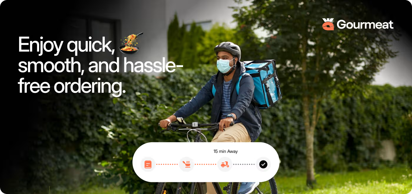
Gourmeat is a modern food delivery app that simplifies (ordering) (tracking) & (enjoying meals)
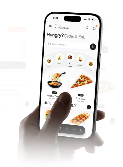
Our task was to design a complete food delivery experience, from building the brand identity to creating a mobile app that makes browsing restaurants, placing orders, and tracking deliveries feel simple and intuitive.
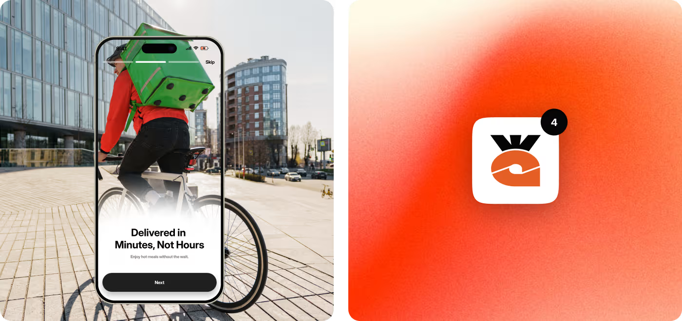

Food ordering took more effort than it should
Gourmeat had the right features, but too many decisions and unnecessary steps can slow people down. The goal was to create an experience that helps users find meals, place orders, and track deliveries without feeling lost or overwhelmed.
- Too much to browse - Finding the right meal could take longer than expected.
- Ordering wasn't always smooth - Moving from browsing to checkout needed to feel more connected.
- Important details were easy to miss - Delivery times, offers, and order information needed better visibility.
- The journey lacked consistency - Different screens needed a more unified experience from start to finish.
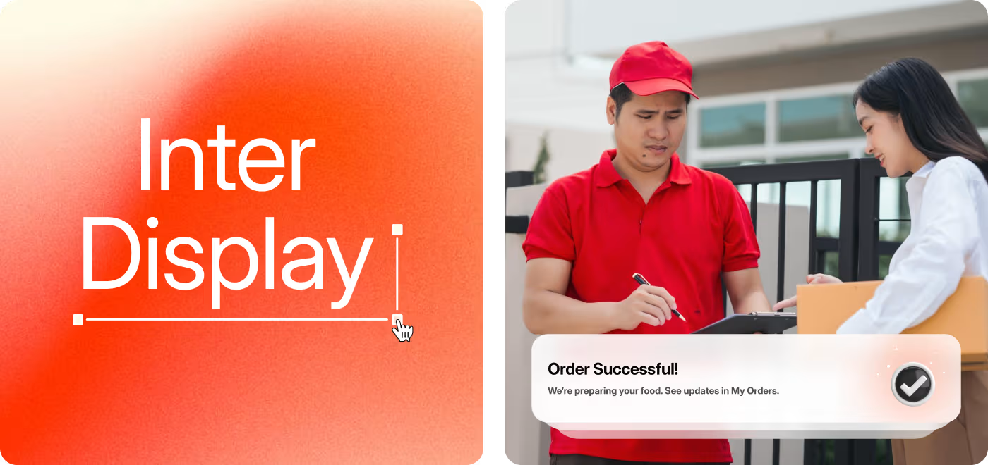
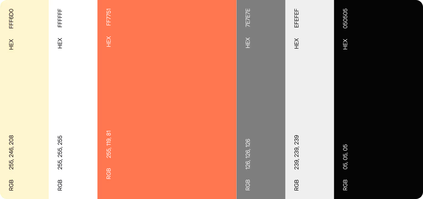
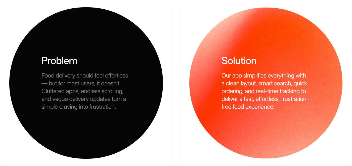
Designed a smoother food ordering experience
Every part of the experience was redesigned to help users move from browsing to checkout with less effort. The focus was on creating a clear ordering flow, improving navigation, and making important information easier to find along the way.
- Made browsing easier — Organized meals and categories so users could find food faster.
- Simplified the ordering flow — Connected every step from restaurant discovery to checkout with fewer interruptions.
- Highlighted what matters most — Brought delivery details, offers, and order information into clearer view.
- Created a more consistent experience — Used a unified design system to make every screen feel familiar and easy to navigate.
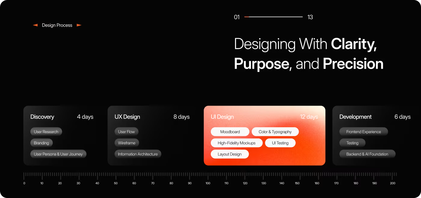
The design process behind Gourmeat
- User journey review
- Pain point mapping
- Decision-making friction
- Checkout drop-off analysis
- Core flow planning
- Navigation structure
- Information hierarchy
- Wireframing key screens
- Meal browsing flow
- Product page design
- Checkout experience
- Visual hierarchy and consistency
- Interface refinements
- Component consistency
- Final mockups
- Handoff-ready screens
Understanding how people order food
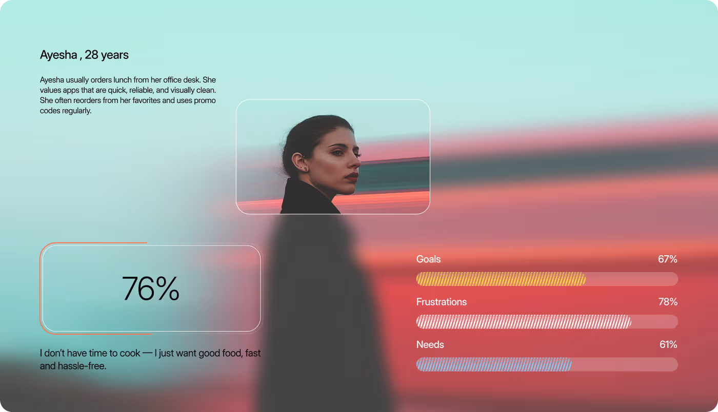
Before designing the app, we looked at how people browse restaurants, choose meals, and place orders on their phones. The research helped us understand where users spent the most time and what could make the experience feel faster and easier.
- User habits — Studied how people search for food, compare meals, and make quick ordering decisions.
- Competitive review — Explored leading food delivery apps to understand familiar patterns and improve the overall experience.
- Order journey — Mapped the complete flow from browsing restaurants to checkout to find places that could be simplified.
- Interface patterns — Reviewed how menus, carts, and checkout screens could be organized to keep ordering clear and effortless.
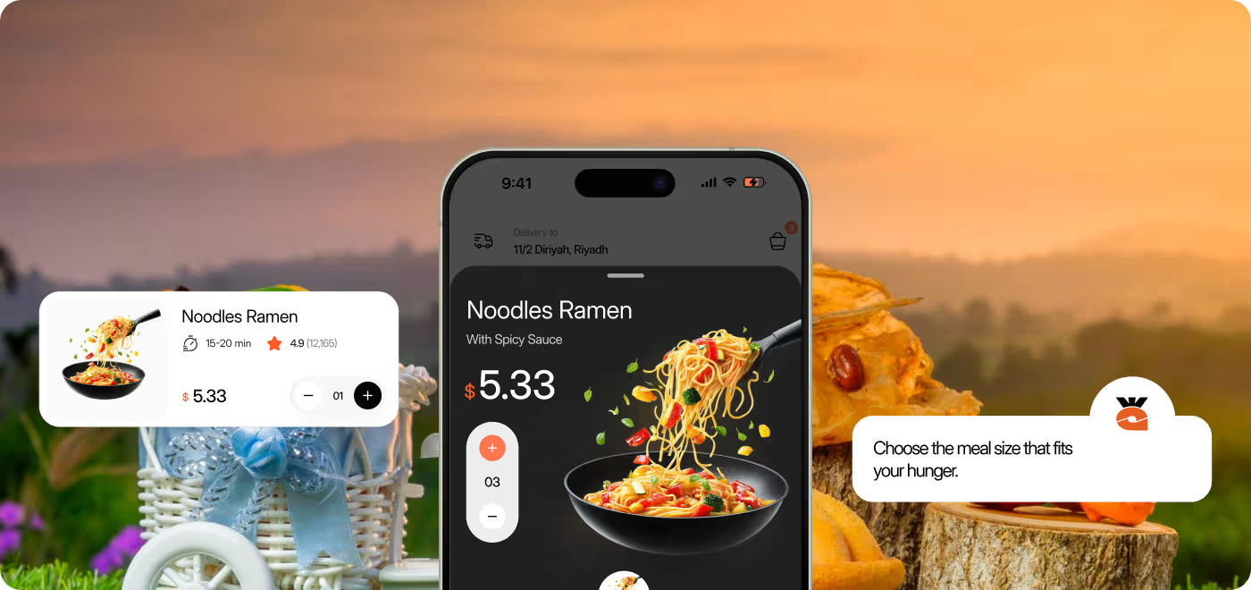
Designing a faster food ordering experience
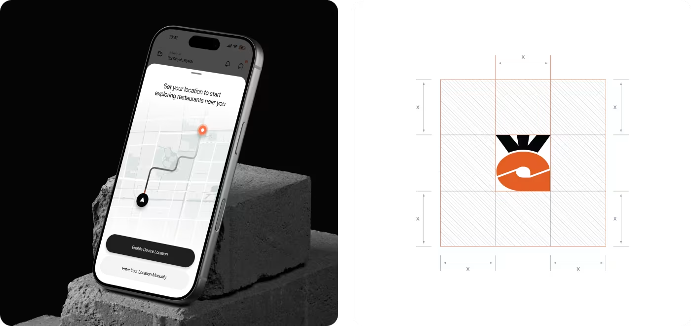
Gourmeat was redesigned to make ordering feel quicker, clearer, and easier to complete. The focus was on reducing hesitation across the journey, from finding food to finishing checkout.
We looked at how users move through the app, where they slow down, and what information they need to make faster decisions. That helped shape a flow that feels more direct and easier to follow.
By simplifying key steps, improving hierarchy, and surfacing important details earlier, the experience became more predictable and less frustrating for everyday use.
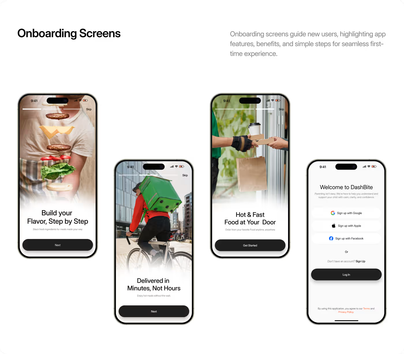
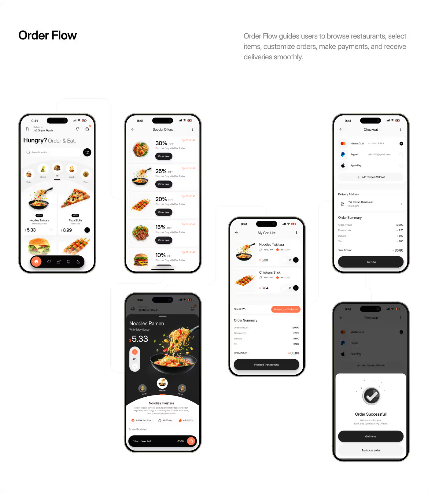
Clear interface, built for quick decisions
The UI design of Gourmeat focused on making the app feel easy to scan, simple to use, and visually consistent across the full ordering flow. We used strong hierarchy, clean layouts, and a focused visual system to help users notice the right information at the right time.
From browsing meals to tracking an order, each screen was designed to reduce noise and support faster actions. The result is an interface that feels more organized, more predictable, and better suited to everyday food ordering.
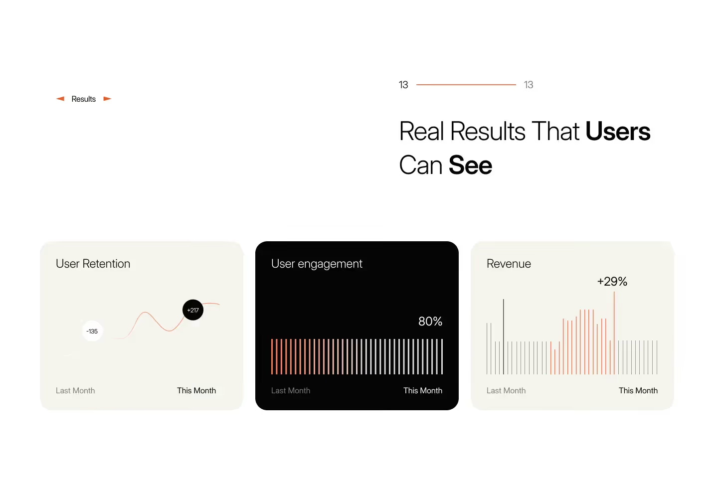
Food ordering became faster, clearer, and easier
The final design brings browsing, ordering, payments, and delivery tracking into one connected experience. A consistent interface, clear user flows, and reusable components make the app easier to use while giving the product a strong foundation for future growth.
- 52+ mobile screens designed across the complete ordering journey.
- 75+ reusable UI components created for a scalable design system.
- 8 end-to-end user flows covering onboarding, browsing, checkout, payments, and order tracking.
- 31% faster checkout experience by reducing unnecessary steps and simplifying the ordering flow.
Ready To Build
Your Next Project?