Fastgo Scooty App

Fastgo Scooty e-scooter rental app illustration by Codeair Software Solutions featuring urban mobility UI design for fast scooter booking experience
Project Overview

Fastgo Scooty is a shared e-scooter app built for one thing: getting urban commuters from point A to point B without the wait.
The project focused on making the entire process - from finding a nearby scooter to paying for the ride completely frictionless. Because the product is entirely time-sensitive, the design had to match the speed of the real world.
Industry
Urban Mobility
Services
UX Design, UI Design, Mobile App Design
Duration
6 weeks
Timeline
2025
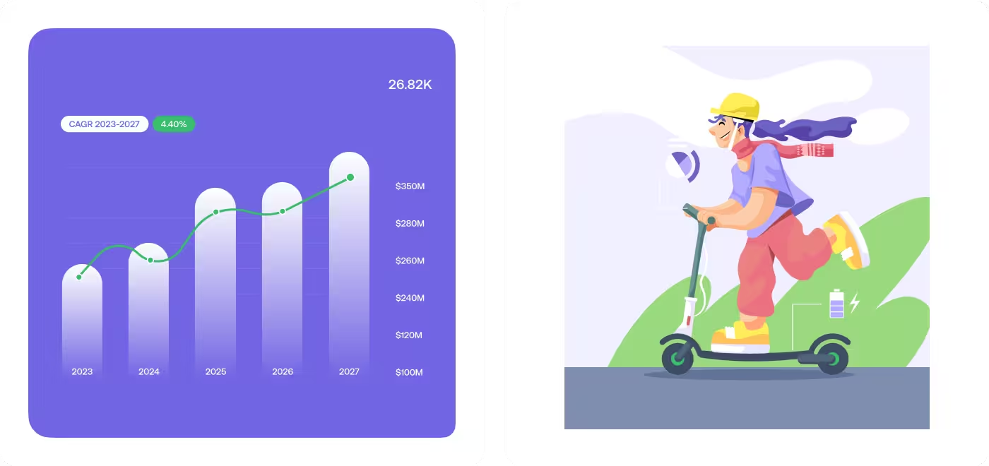
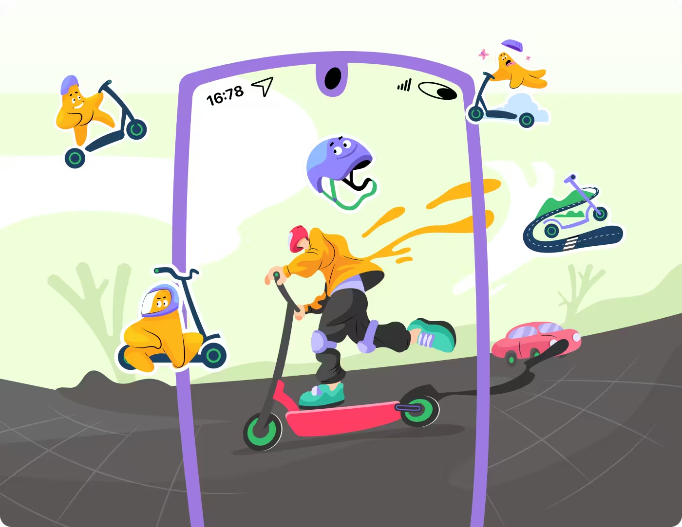
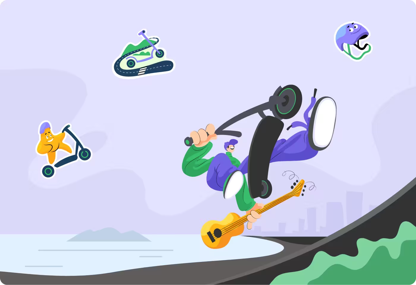
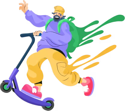
Fastgo Scooty character illustration by Codeair Software Solutions showing rider on electric scooter representing frictionless urban commuter app design

Design for speed. People using Fastgo are not opening the app to explore features; they are standing on a sidewalk, in a hurry, and trying to get somewhere. Our job was to design an interface that gets them on a scooter as fast as humanly possible, while still making sure they have enough information to choose the right scooter and stay safe.
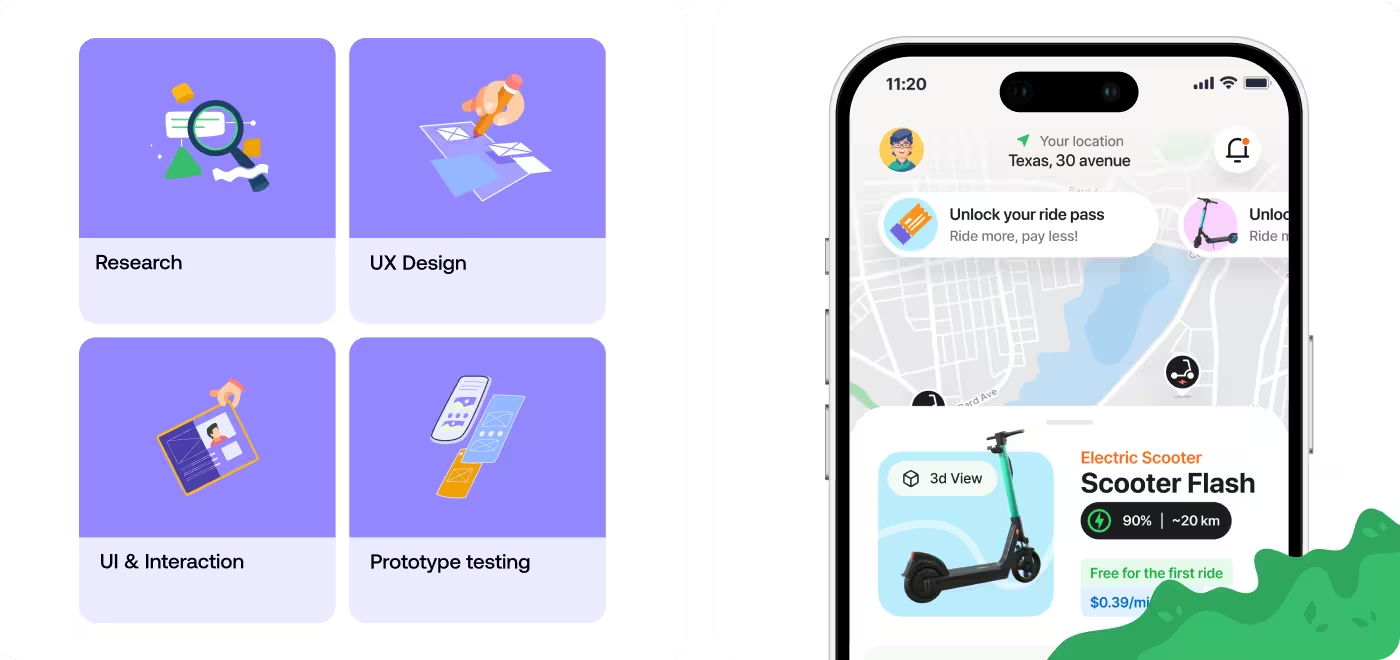
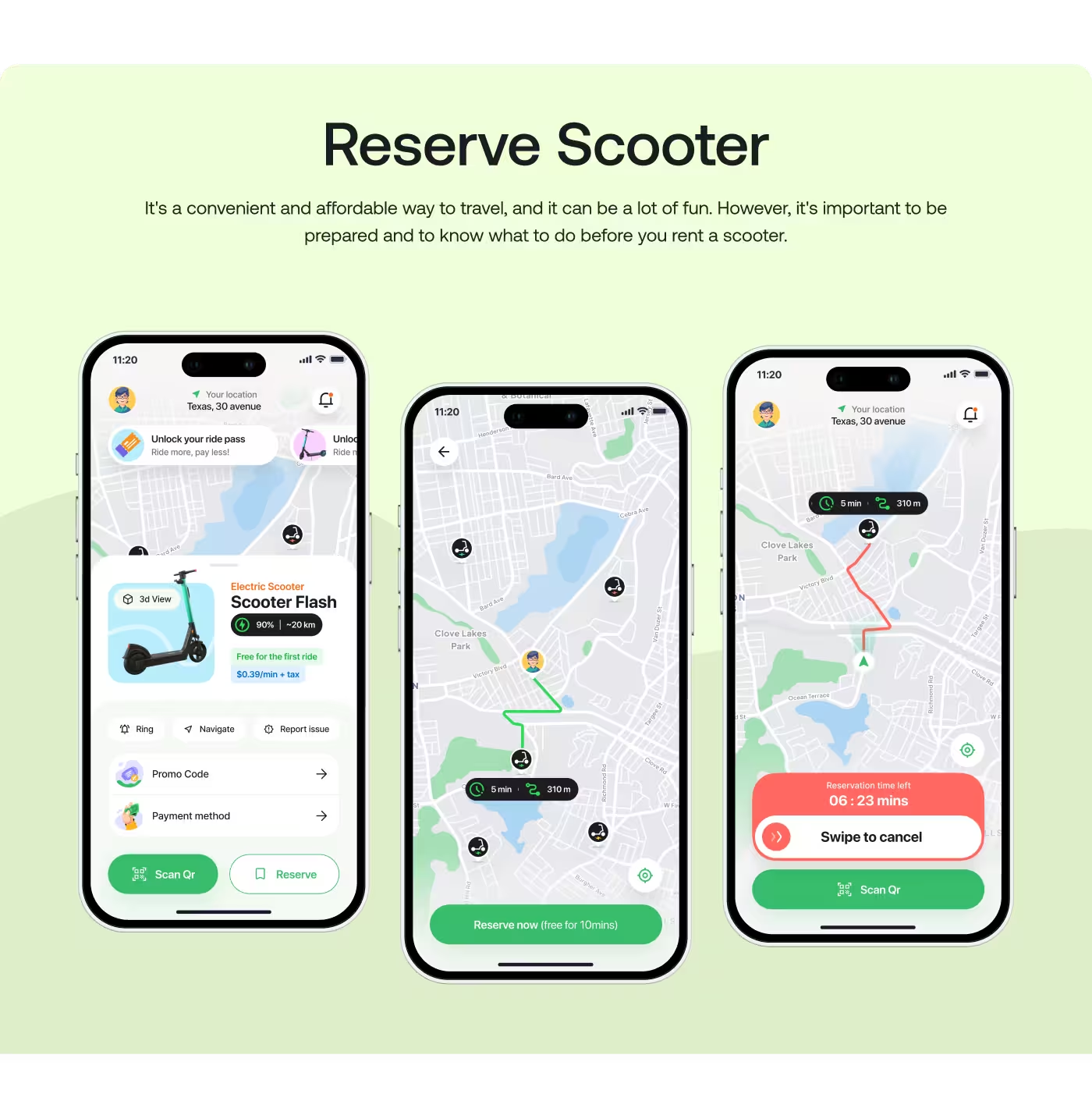
Fastgo Scooty app screens designed by Codeair Software Solutions displaying nearby scooter map and quick booking interface for urban commuters
Codeair Software Solutions mobile app design preview for Fastgo Scooty showing scooter selection and ride details interface
Fastgo Scooty app screens by Codeair Software Solutions displaying ride tracking and payment interface for e-scooter rental service
Codeair Software Solutions UI design preview for Fastgo Scooty showing scooter unlock and ride completion screens for fast urban transport
No items found.
PROBLEM

The App Was Too Hard to Follow

People needed help keeping up with daily medication and health details, but the app was making that feel more complicated than it should.

  • Too much information: The screen showed a lot at once, so it was easy to miss what mattered most.
  • No clear next step: Users could see data, but they could not quickly tell what they should do next.
  • Hard for older users: The app felt too busy and too complex for seniors to use with confidence.
  • Caregivers had to dig for answers: It was not easy for caregivers to check how someone was doing at a glance.
Codeair Software Solutions case study showing Fastgo Scooty app problem of cluttered screens making it hard for users to quickly spot key ride information
Fastgo Scooty problem analysis by Codeair Software Solutions highlighting confusing navigation and unclear action steps in scooter booking flow
No items found.
SOLUTION

We Turned the App Into a Clear Daily Guide

Instead of showing users too much at once, we designed Wellnest to show the next step clearly and make daily health tracking feel easier.

Bullets:

  • Clear daily tasks: We made the app show what the user should do next, not just a wall of data.
  • Simpler health info: We used large cards, progress bars, and plain labels so the important details were easy to scan.
  • Calm visual style: We chose soft colors and a gentle layout so the app felt supportive, not stressful.
  • Caregiver view: We also gave caregivers a quick way to check progress, adherence, and patient status without digging around.
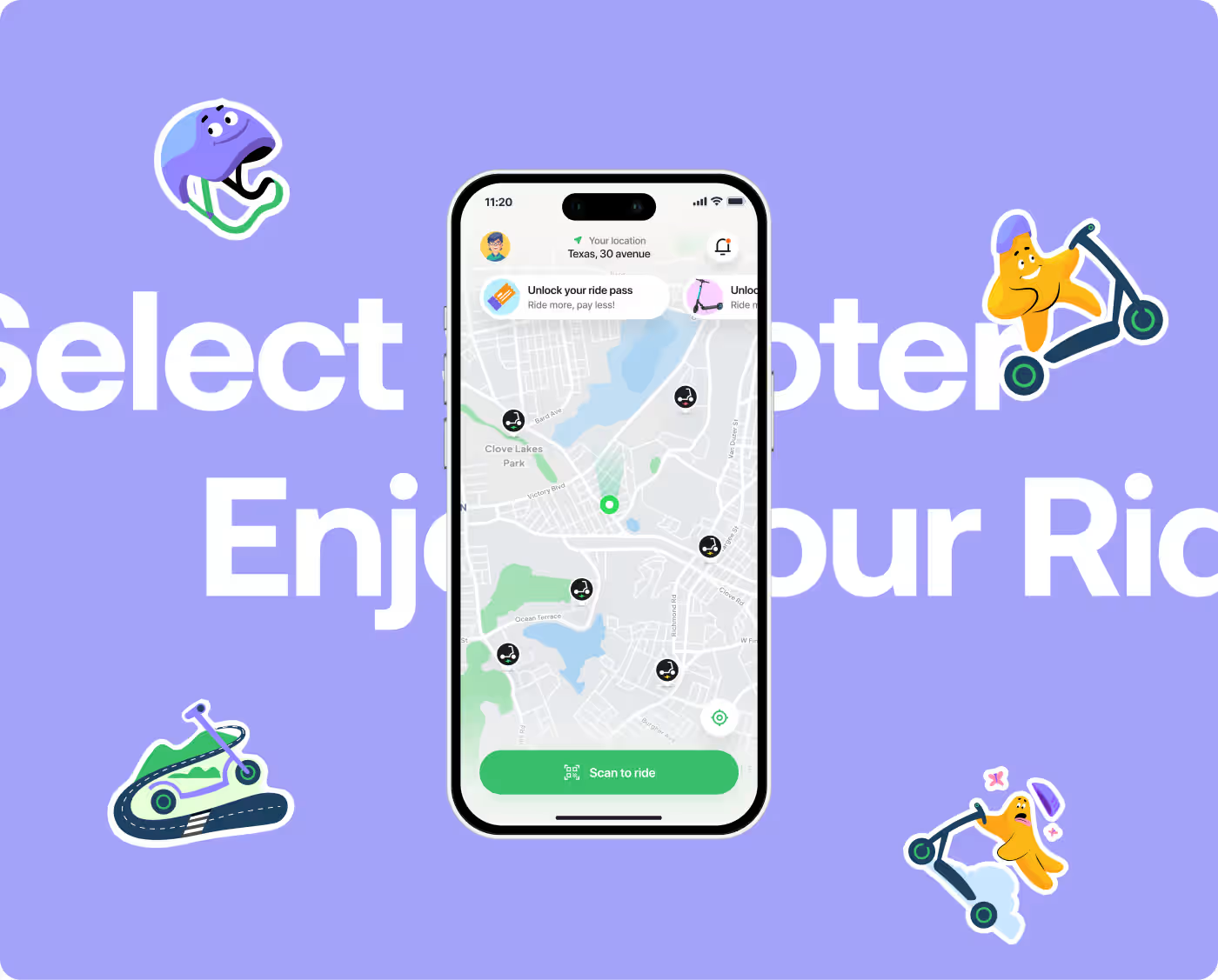
Codeair Software Solutions UX research for Fastgo Scooty analyzing urban commuter behavior and quick decision-making needs for scooter rental
Fastgo Scooty research documentation by Codeair Software Solutions showing user pain points in booking speed and information clarity
Codeair Software Solutions research insights for Fastgo Scooty showing simplified wording and interface trust-building for e-scooter app users
No items found.
PROCESS

We Kept Things Simple on Purpose

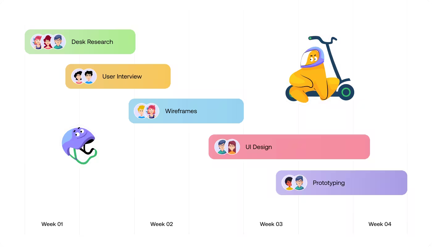
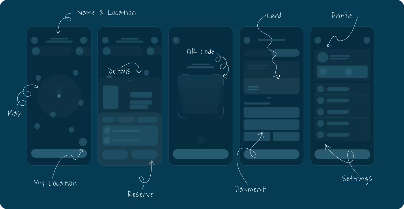
The goal was to make the app feel easy to use, so we broke the experience into small steps that were easier to understand and act on.
01
Understand
We looked at what older users and caregivers needed most, then focused on the parts that caused the most confusion.
  • Find the pain points
  • See what users need
  • Keep the focus on important tasks
02
Simplify
We removed extra noise and turned the screens into something easier to scan and follow.
  • Show less at once
  • Use simple labels
  • Make the next step easier to spot
03
Design
We shaped the app with soft colors, large cards, and clear sections so it felt calm and easy to read.
  • Keep the layout clean
  • Make important info stand out
  • Use a style that feels friendly, not clinical
04
Refine
We checked the screens again and again to make sure the flow felt smooth for both seniors and caregivers.
  • Improve anything that felt confusing
  • Make the flow easier to follow
  • Keep the experience consistent across screens
No items found.
RESEARCH

We Studied What Seniors and Caregivers Needed Most

Before designing, we looked at how older adults handle daily medication and what caregivers need to check without feeling overwhelmed.

  • Older users need clarity fast: The biggest thing we found was that seniors do better when the app shows one clear action at a time.
  • Too much data creates stress: Charts and numbers can be useful, but only if they are easy to understand right away.
  • Caregivers need quick updates: They do not want to search through screens just to see if medication was taken or if something changed.
  • Simple wording matters: Plain language helps the app feel less clinical and makes it easier for people to trust and use.
Fastgo Scooty simplified booking flow by Codeair Software Solutions showing streamlined path to scooter selection and ride confirmation
Codeair Software Solutions booking interface design for Fastgo Scooty showing clear labels and direct path to key ride actions
Fastgo Scooty app flow by Codeair Software Solutions showing fewer steps and faster access to scooter reservation features
No items found.
Services

Made the App Easier to Follow

The main focus was to turn a confusing health experience into something that felt simple and clear. Older users needed to understand what to do next without digging through too much information, so the flow was shaped around that.

We designed the app around daily tasks, not just data. That meant fewer steps, clearer labels, and a more direct path to the most important actions. For caregivers, the flow also needed to make it easy to check progress without searching around.
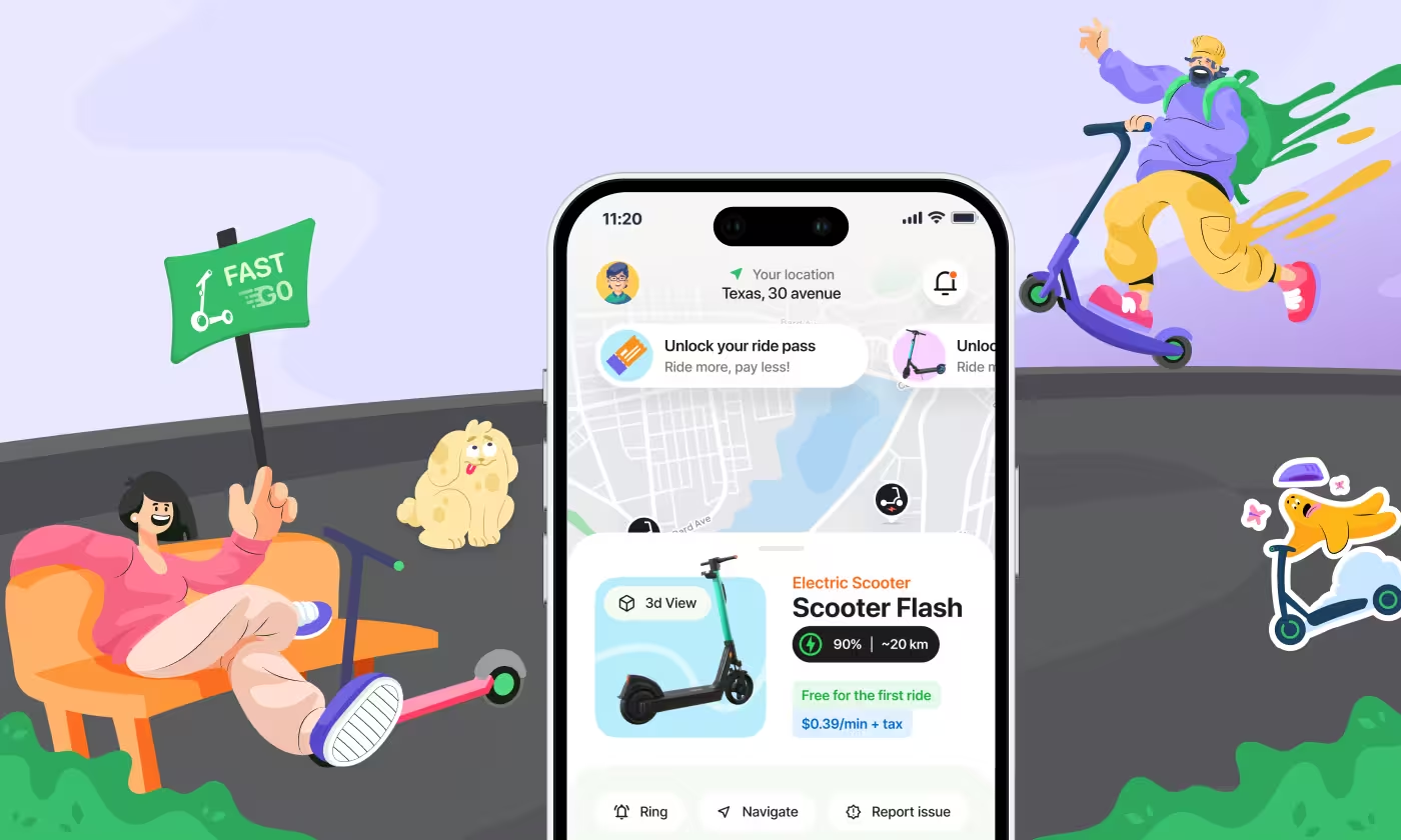
Fastgo Scooty home screen mockup by Codeair Software Solutions showing electric scooter details, ride pass unlock, and location map surrounded by playful brand character illustrations
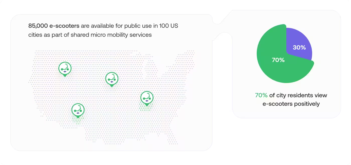
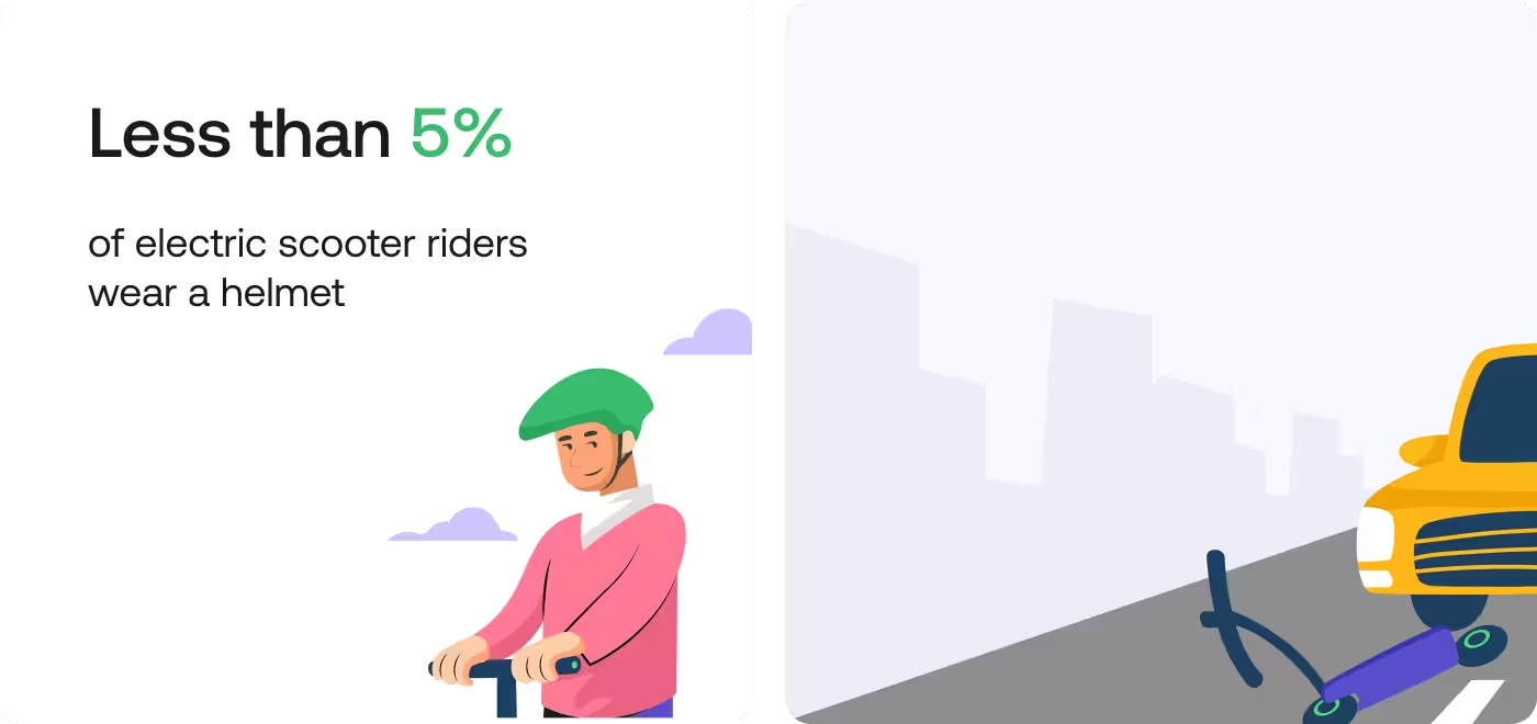
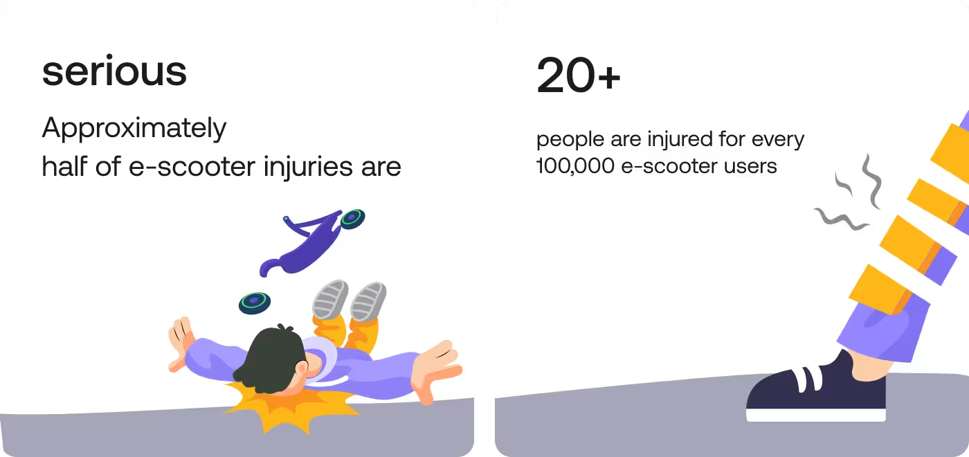
Fastgo Scooty safety awareness illustrations by Codeair Software Solutions showing e-scooter injury statistics with serious injury and 20+ per 100,000 users data visualization
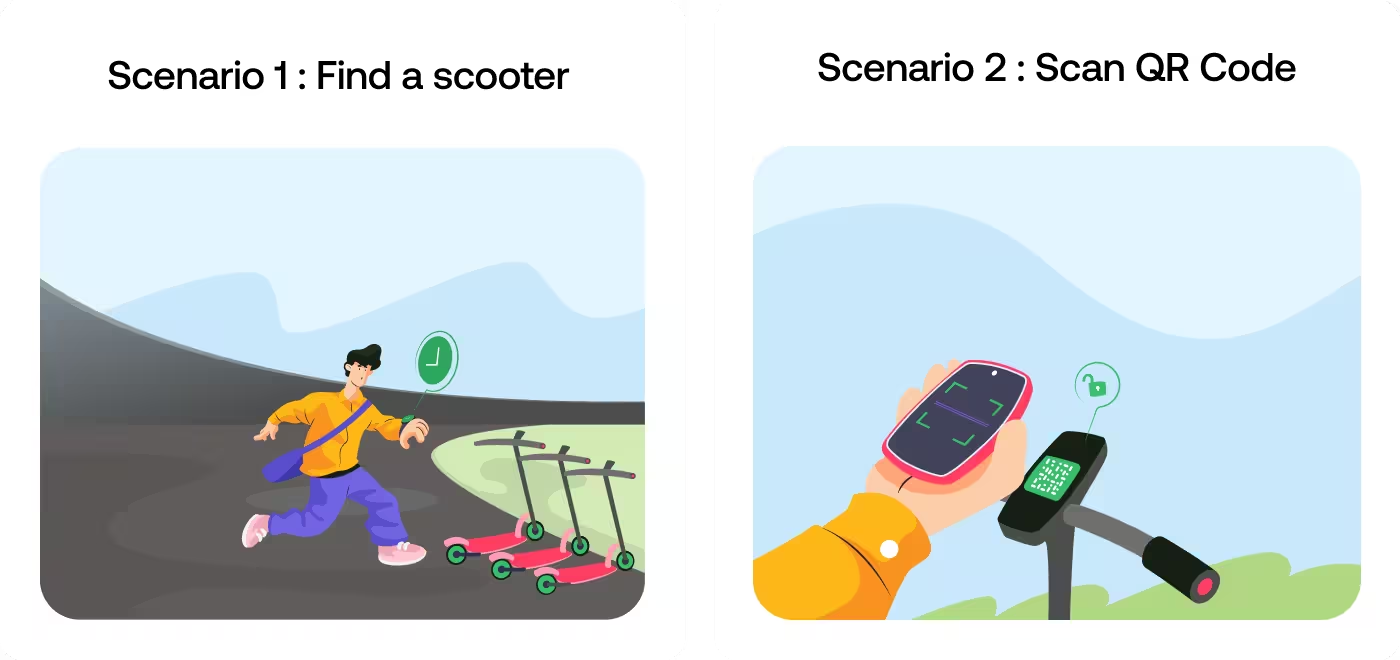
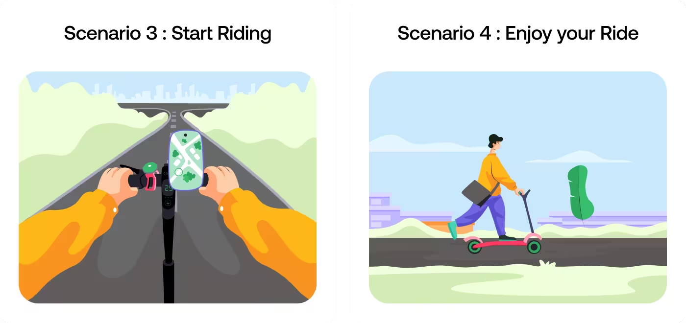
Fastgo Scooty user scenario illustrations by Codeair Software Solutions showing handlebar map view for starting a ride and rider commuting on electric scooter through city street
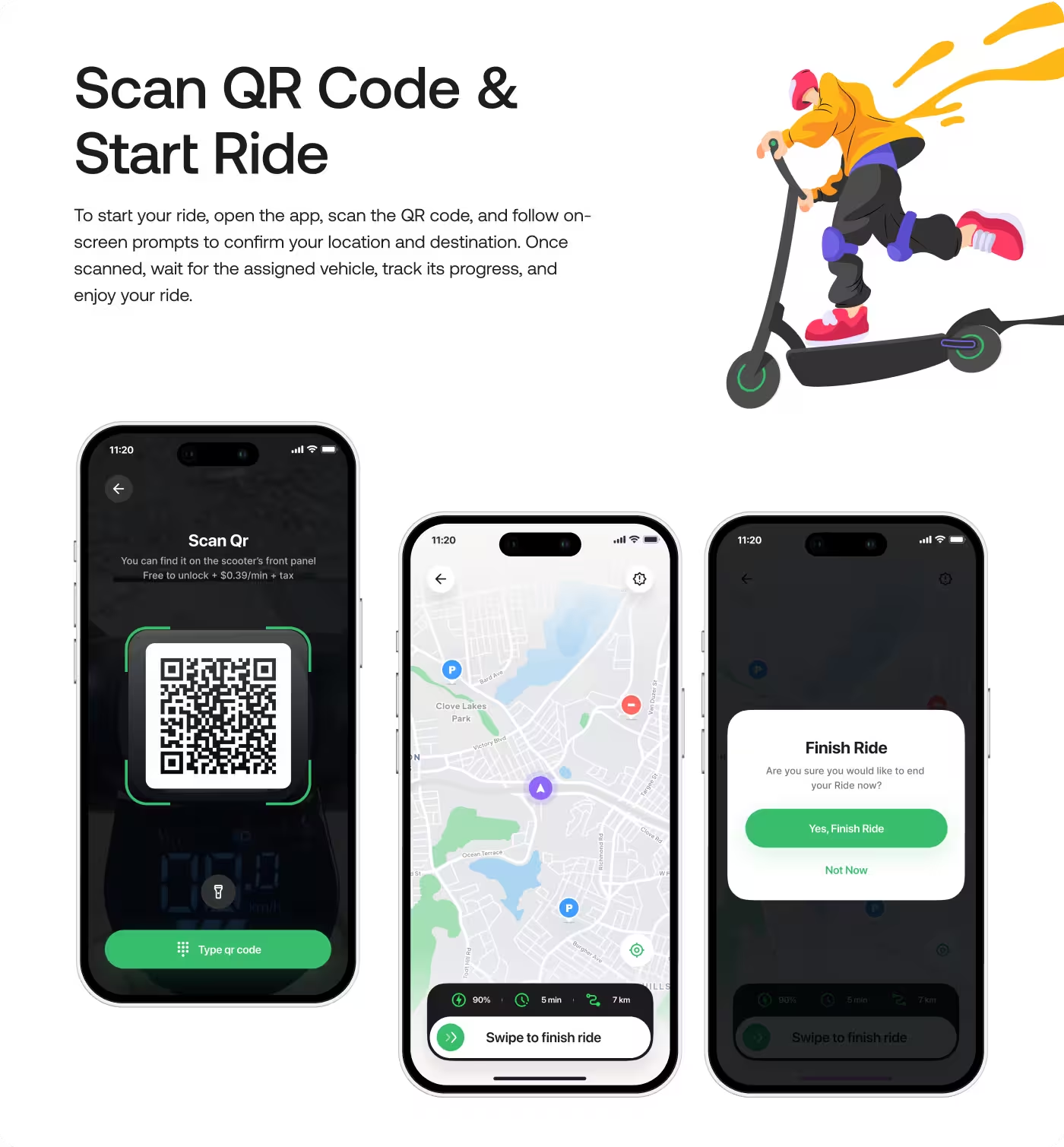
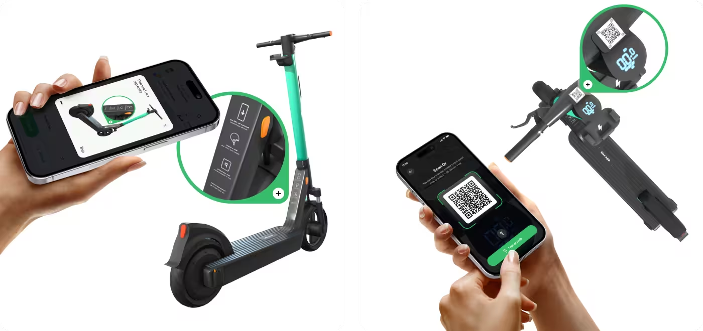
Fastgo Scooty app unlock interface by Codeair Software Solutions showing phone AR scanning view paired with physical e-scooter, plus QR code scan screen to activate ride
No items found.
Services

Gave the App a Calm and Readable Look

The visual side of the app was built to feel soft, friendly, and easy on the eyes. Since the users included older adults, the interface needed to be clean, with enough space, clear contrast, and simple sections that were easy to scan.

Large cards, gentle colors, and easy-to-read layouts helped the app feel less stressful. The design also made key health details stand out without making the screen feel crowded or clinical.
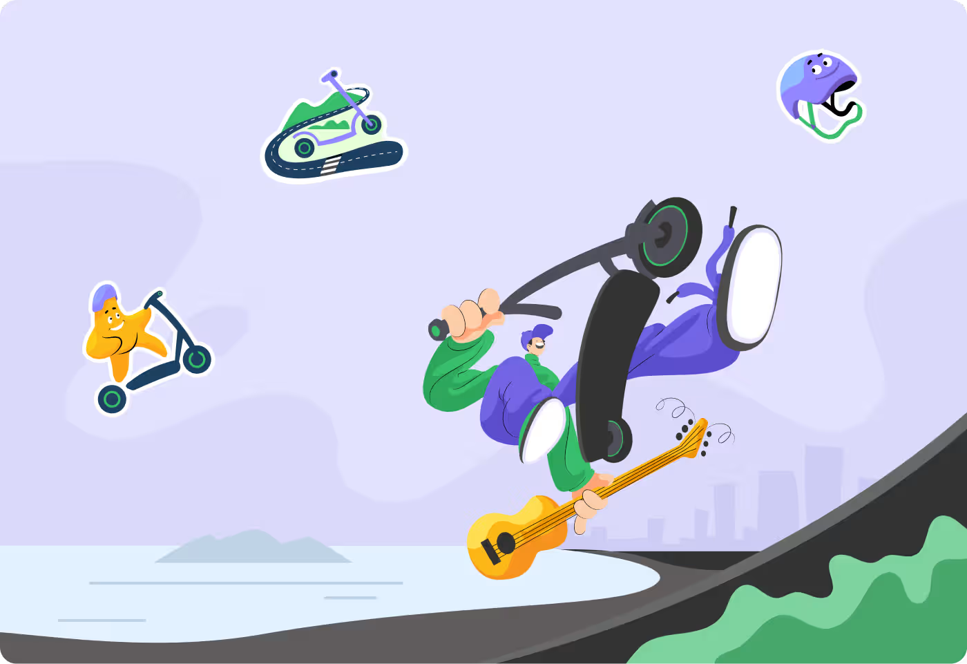
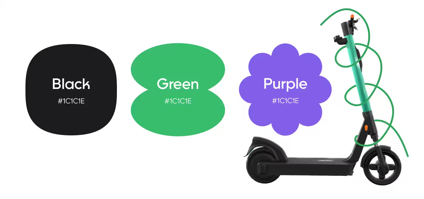
Fastgo Scooty visual identity illustration by Codeair Software Solutions showing clean, modern brand style for urban e-scooter mobility app
No items found.
RESULTS & OUTCOMES

The App Became Easier to Use and Easier to Trust

After the redesign, the app felt more calm, more readable, and more focused on what people needed to do each day. Instead of making users work hard to understand the screen, it gave them a clearer path and made the whole experience feel less stressful.

  • Clearer daily use: People could see what to do next without guessing.
  • Less confusion: The simpler layout made the app easier for older users to follow.
  • Faster caregiver checks: Caregivers could quickly understand a patient’s status at a glance.
  • Better peace of mind: The app felt more supportive, which made daily medication tracking feel less heavy.

Ready To Build
Your Next Project?

We'll schedule a call to discuss your idea. After discovery sessions, we'll send a proposal, and upon approval, we'll get started.
Portrait of a man with short black hair and beard, wearing a black suit and tie with a pale green background.
Three men smiling, arranged in a row with circular frames around their faces against a white background.
105+ Brands Scaled
1
you
Valid number
2
your company
3
Project creativity
4
Heard about us?
5
Project timeline
Thank you!
Your submission has been received!
Oops! Something went wrong while submitting the form.

Explore More Case Studies

All Projects
Sunmughan Swamy
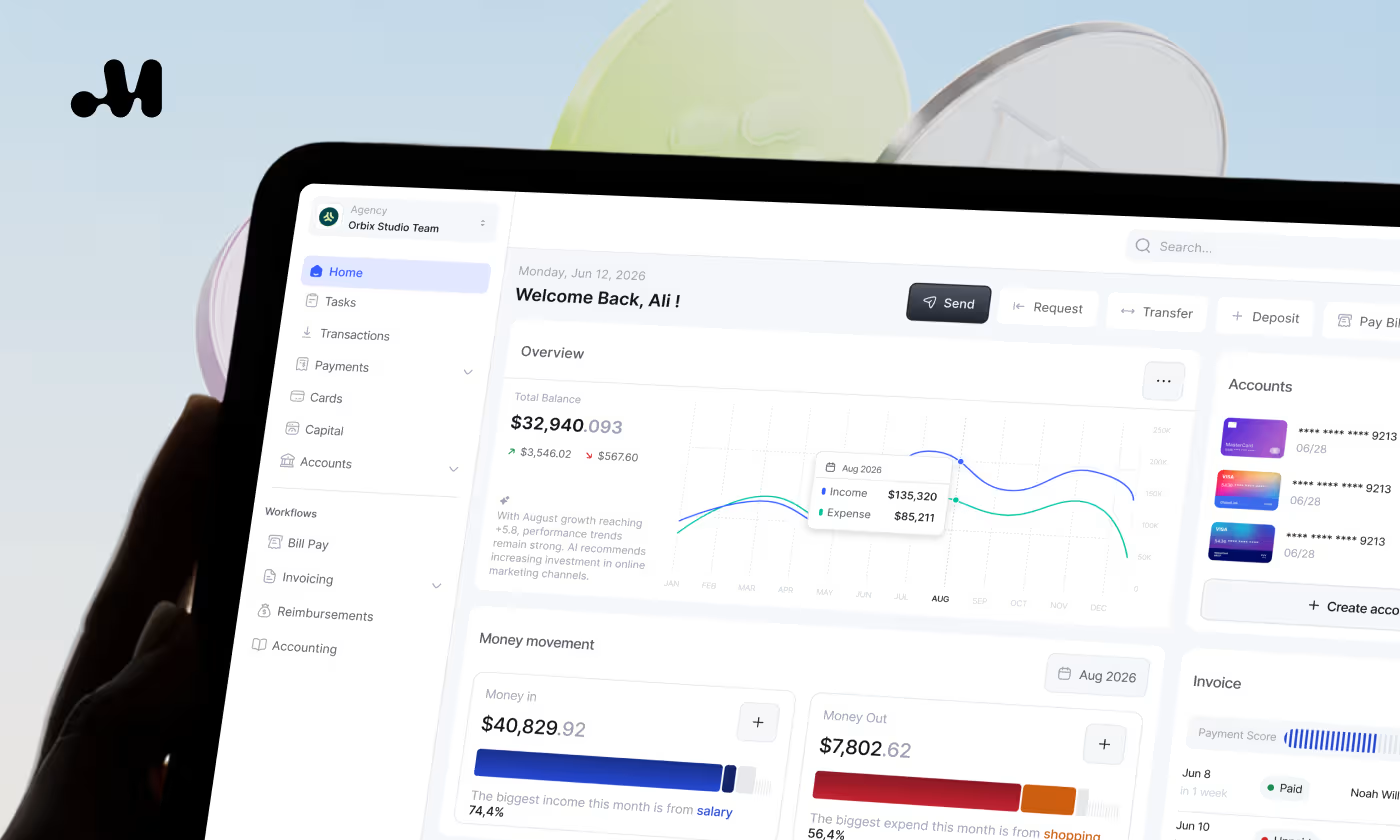
Explore how we designed Maven, a modern financial management platform, through user research, product strategy, and UX/UI design to simplify business finance.
Maven Financial Management
Dhaka Regency Hotel & Resort premium brand design case study thumbnail by Codeair Software Solutions showing gold star logo and black branding for luxury five-star hotel in Dhaka, Bangladesh
Dhaka Regency Hotel & Resort offers premium dining and spa experiences near the city's airport and business hubs.
Dhaka Regency
Branding Design
Furmate Case Study: Building a Playful Pet Food Identity from Scratch
Furmate is a comprehensive visual identity system designed for a pet food company aiming to stand out through charm and warmth.
Furmate
Branding Design
Fastgo Scooty App — Case Study | Codeair Software Solutions | Codeair Software Solutions