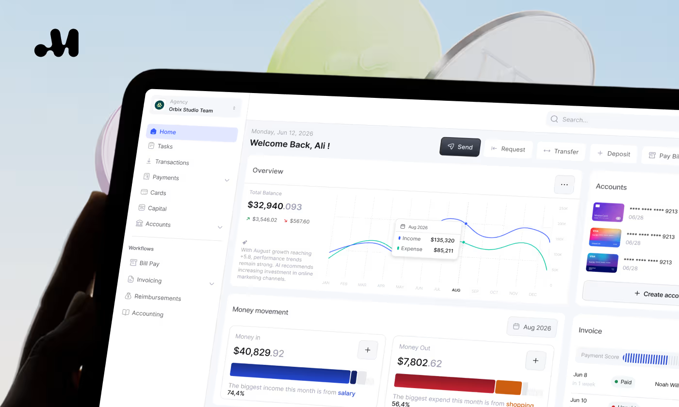


InvestIQ


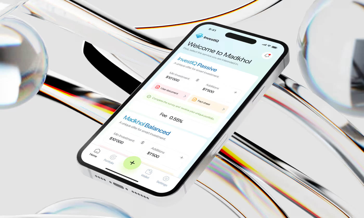

InvestIQ is a mobile investment app designed to help users monitor and manage their portfolios.
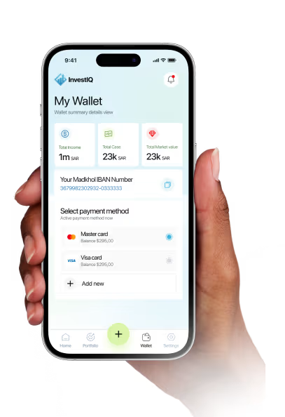
Our task was to redesign InvestIQ so that heavy financial data feels light and actionable. Users needed a clear way to read their profit and loss, track assets, and navigate the app. While the experience also had to support quick decision-making by removing unnecessary noise and highlighting what matters most.
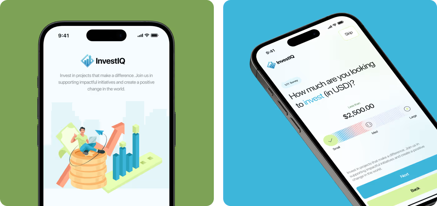
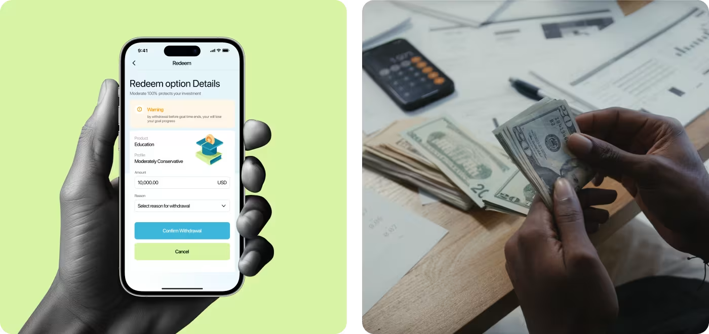
Making Investing Feel Easier to Understand
Investing shouldn't feel confusing from the first screen. Our goal was to simplify the experience, guide users through each step, and make important financial decisions feel more approachable.
- Investment options felt overwhelming: Users needed a simpler way to compare products without sorting through too much financial information.
- The journey lacked clear guidance: Moving from onboarding to making an investment needed to feel more structured and easier to follow.
- Building trust was essential: Investment decisions involve risk, so the interface needed to explain important details clearly before users committed.
- The experience needed more consistency: From portfolio management to withdrawals, every screen had to feel connected, familiar, and easy to navigate.
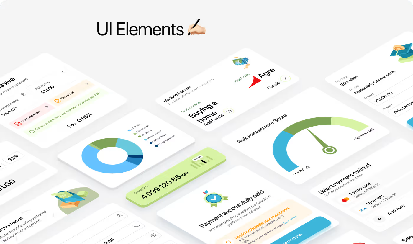
Designed a Simpler Investment Experience
Instead of overwhelming users with financial details, we redesigned the experience around clear steps, guided decisions, and a consistent interface that makes investing easier to understand from start to finish.
- Simplified the investment journey: Organized the experience into clear, step-by-step flows so users always knew what to do next.
- Made investment options easier to compare: Used clean layouts and structured cards to highlight the information users needed before making a decision.
- Added guidance where it mattered most: Introduced onboarding, risk assessment, and supporting details to help users invest with more confidence.
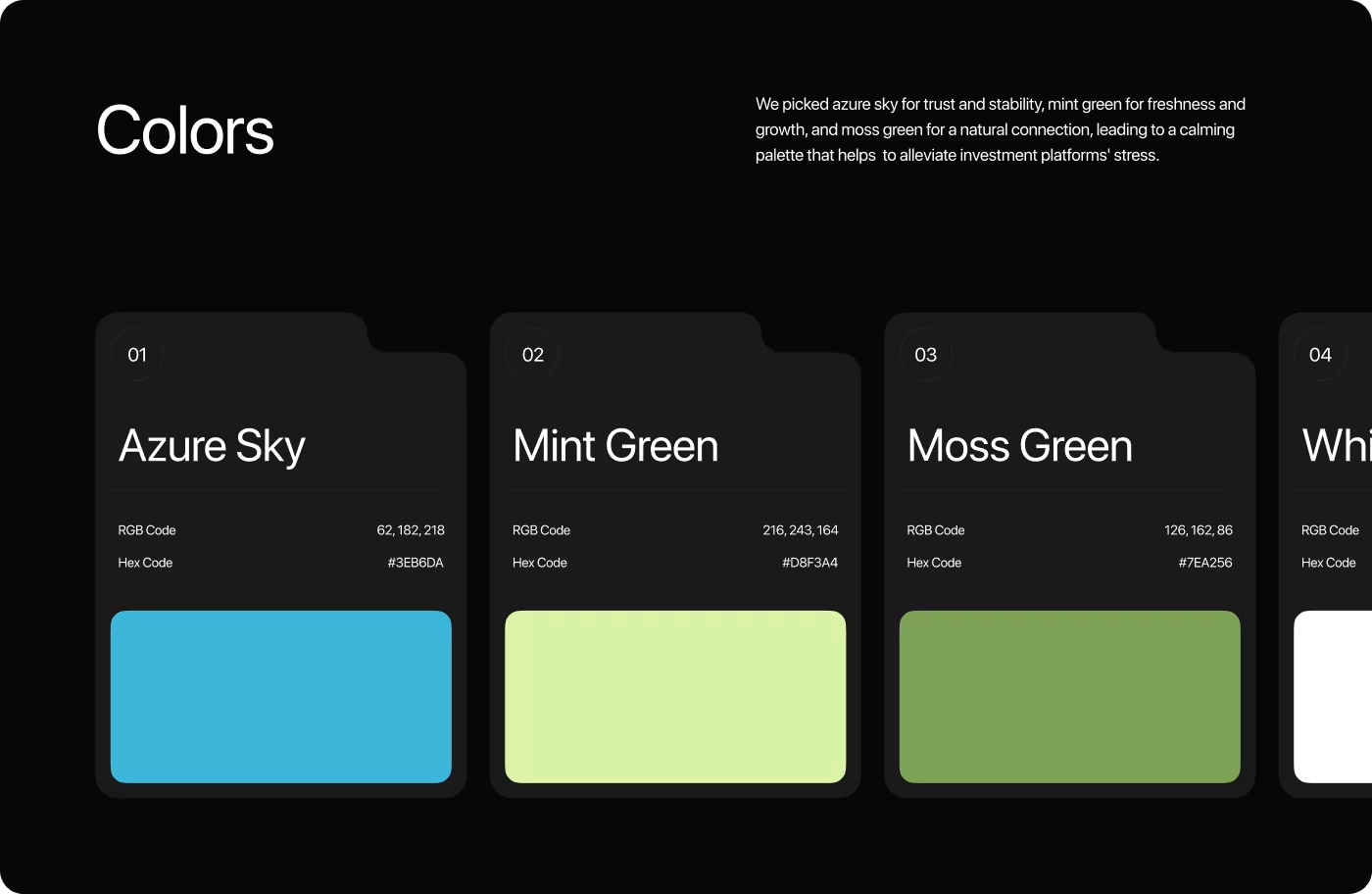
- Built a consistent design system: Created reusable components, patterns, and visual styles to keep every screen familiar and easy to navigate
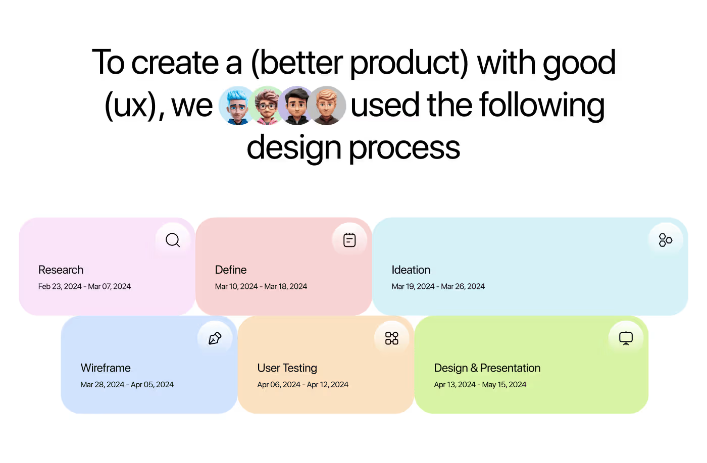
Designed the investment experience through a simple UX process
- Product research
- User research
- Competitor review
- Problem mapping
- User flows
- Information architecture
- Wireframes
- Journey mapping
- UI design
- Design system
- Interactive prototype
- Component library
- Usability testing
- Design iteration
- Developer handoff
- Final documentation
Understanding how people make investment decisions
Before designing the app, we explored how people discover investment opportunities, compare options, and decide where to put their money. That helped us build an experience that feels simpler and easier to follow.
- User behavior: Looked at how people explore investment products, compare options, and make financial decisions on mobile.
- Competitive analysis: Reviewed popular investment apps to understand common patterns and identify opportunities to simplify the experience.
- User journey mapping: Mapped the complete investment flow to uncover places where users might hesitate or lose confidence.
- Interface patterns: Studied how financial information could be organized to make important details easier to scan and understand.
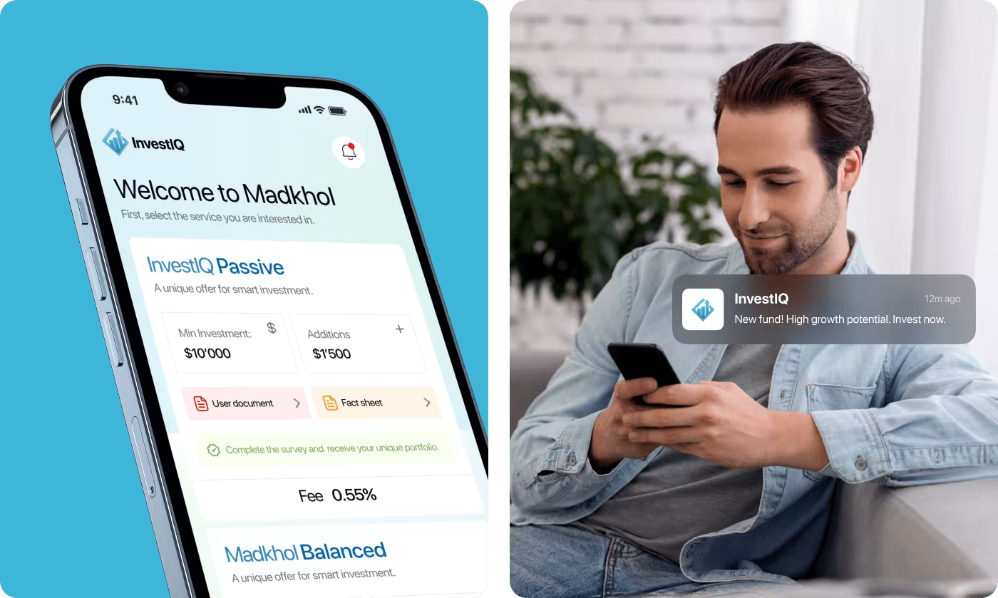
Building a Clear Investment Journey
Before moving into visual design, the focus was on understanding how people approach investing on mobile. The investment journey was broken down into smaller, manageable steps so users could move through the app without feeling overwhelmed by financial information.
Research, user flows, and information architecture helped shape the experience before a single high-fidelity screen was designed. Every interaction was planned to guide users naturally - from onboarding and risk assessment to selecting investment products and managing their portfolio.
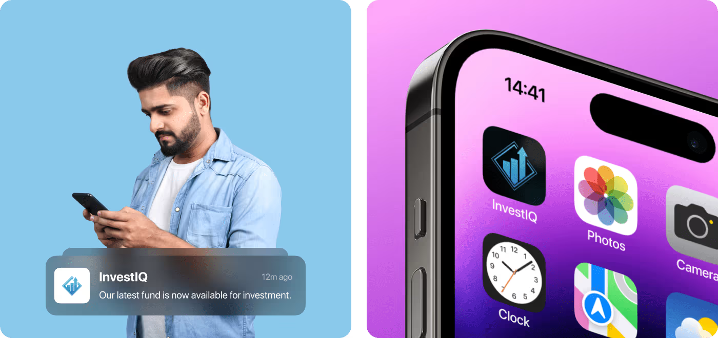
Designing a Simple and Trustworthy Interface
The interface was designed to make investment decisions feel clearer through clean layouts, thoughtful spacing, and consistent visual patterns. Rather than filling screens with financial data, information was organized into easy-to-read cards and focused actions that help users stay on track.
A reusable design system was created to keep the experience consistent across onboarding, investment management, payments, withdrawals, and portfolio tracking. This made the product easier to navigate while giving the platform a polished and cohesive visual identity.
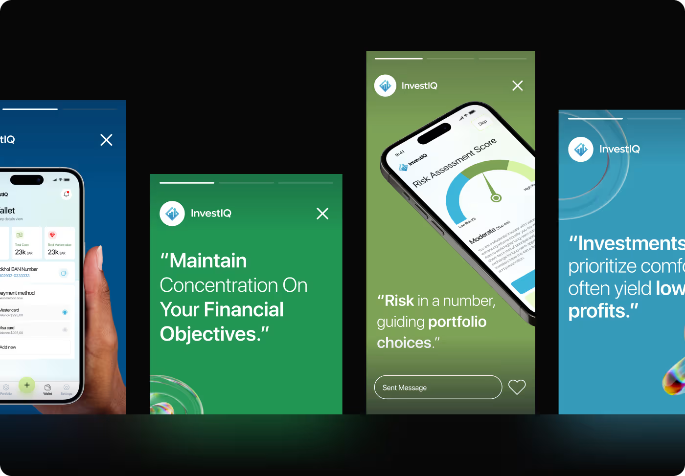
A simpler investment experience from start to finish
The final product turned a complex investment process into a guided mobile experience that's easier to understand and navigate. Every screen was designed to help users make informed decisions while giving the product a consistent and trustworthy look.
- 48+ mobile screens designed to support the complete investment journey, from onboarding to portfolio management.
- 65+ reusable UI components created to keep the experience consistent and make future updates easier.
- 7 key user flows mapped and designed, covering investing, payments, withdrawals, risk assessment, and account management.
- Cleaner and more approachable product that helps users understand investment options without feeling overwhelmed.
Ready To Build
Your Next Project?